Hanging art can transform a space, adding personality and style. Here are some key rules and tips to ensure your art is displayed beautifully and effectively, incorporating insights from leading design experts.
1. Hang at Eye Level
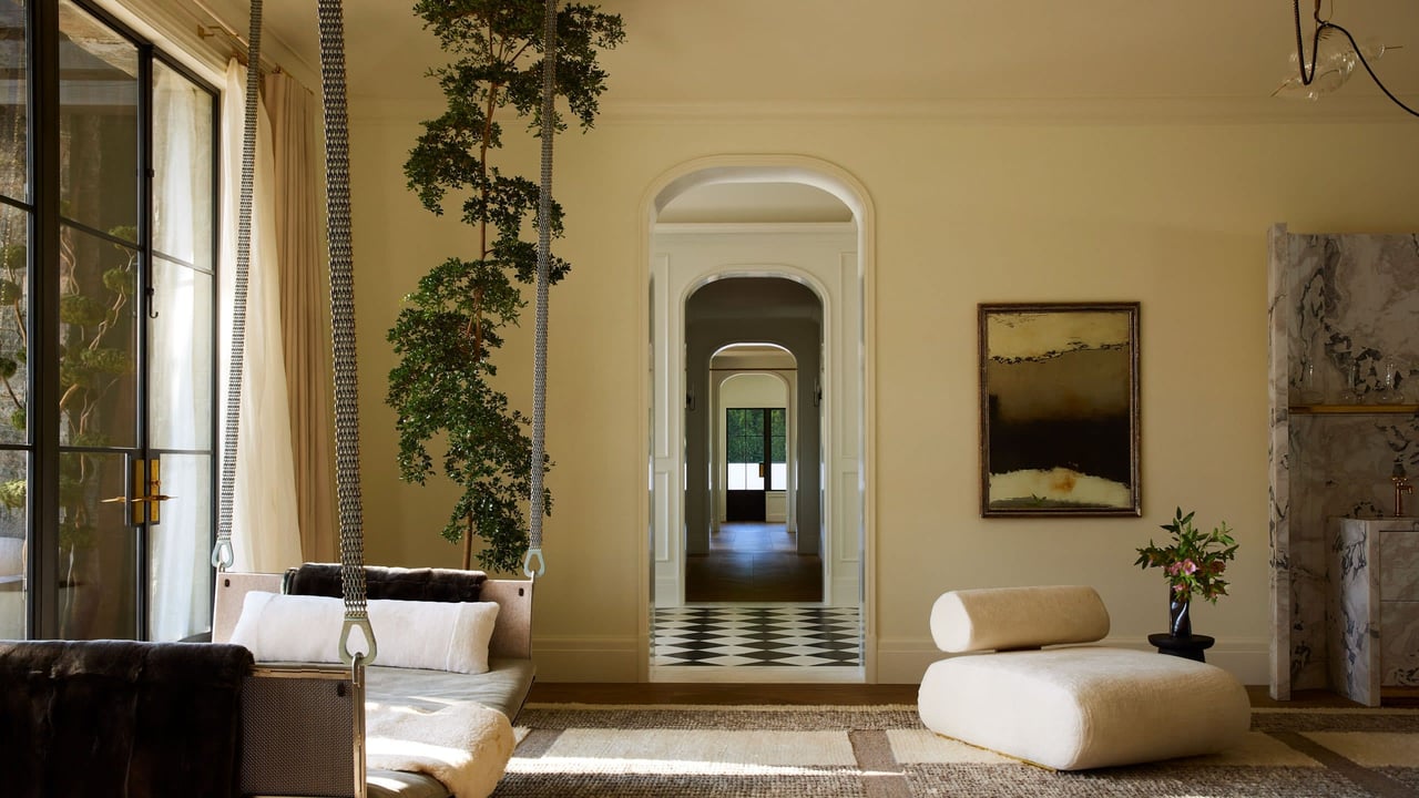
One of the most important rules is to hang art at eye level. This typically means the center of the artwork should be about 57 to 60 inches from the floor. This guideline ensures that the artwork is easily viewable and creates a cohesive look throughout your home. This tip ensures the art can be admired comfortably.
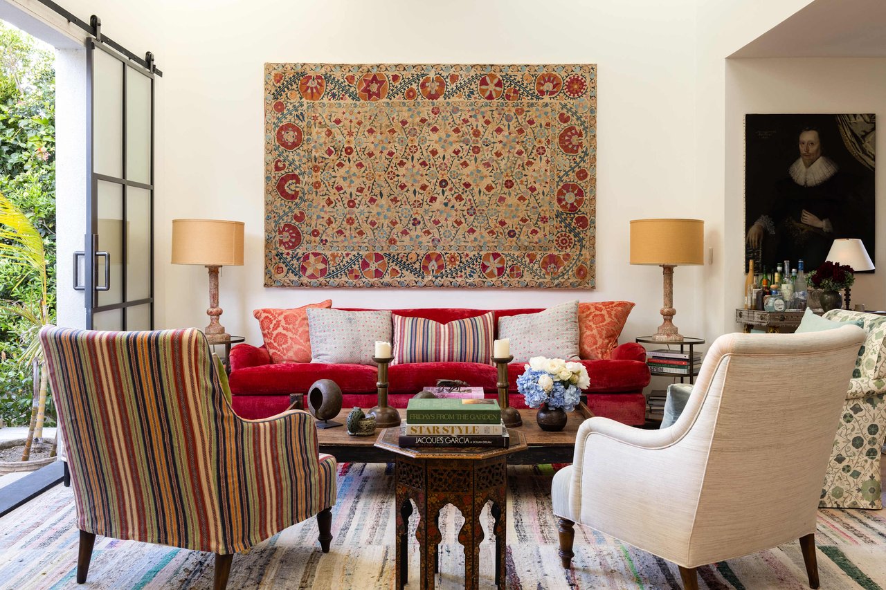
2. Align with Furniture
When hanging art above furniture, such as a sofa or a console table, ensure the bottom edge of the artwork is 6 to 8 inches above the furniture. This spacing creates a cohesive look and ties the artwork to the rest of the room. For a gallery wall, the rule still applies—start the lowest frame 6 to 8 inches above the furniture.
3. Create Balance and Symmetry
For a balanced look, especially in more formal rooms, symmetrical arrangements work best. This means equal spacing and similar sizes for artworks. However, asymmetrical arrangements can also be striking, particularly in casual or eclectic spaces. The key is to maintain visual balance by varying the size, shape, and orientation of the pieces while keeping a consistent distance between them.
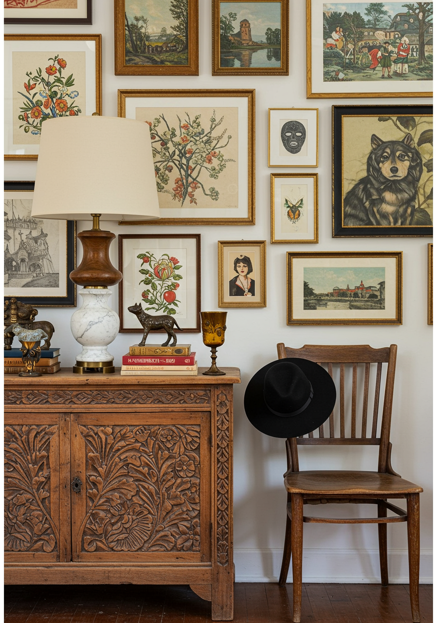
4. Group Artworks Strategically
When creating a gallery wall or grouping multiple pieces, lay them out on the floor first to determine the best arrangement. Start with the largest piece in the center and arrange smaller pieces around it. Consider the overall shape of the grouping and ensure it fits well within the wall space. Use consistent spacing, typically 2 to 3 inches between frames, to keep the arrangement cohesive.
5. Consider the Wall Color and Texture
The background against which you hang your art significantly impacts its appearance. Dark walls can make lighter artworks pop, while light walls provide a neutral backdrop for bold pieces. If your walls have texture, like brick or wood, consider how the texture interacts with the artwork. Sometimes, simple frames and minimalistic art look best on textured walls.
6. Spacing and Composition
Maintain even spacing between frames. Generally, two to three inches between frames works well for most arrangements. For a grid layout, precise measuring is crucial for a clean, structured look. For more organic arrangements, feel free to experiment with spacing and layout. Treat multiple works as one unit to create a balanced display.
7. Adjust According to the Room’s Function
In high-traffic areas or rooms with specific functions, consider the durability of the art and frames. For instance, avoid placing delicate pieces in kids' rooms or high-moisture areas like bathrooms.
8. Experiment and Adapt
Don’t be afraid to experiment with different arrangements and placements. Take a step back and view your arrangement from different angles. If something doesn’t feel right, adjust it. Sometimes, the most unexpected placements create the most stunning displays.
Happy decorating!